
Intro
Project Summary
As part of the mobile navigation redesign for Caldera, I reconstructed the information architecture to improve usability and streamline access to key areas. The sticky navigation bar was updated with shortcuts to "Owner," "Dealer," and "Shop," ensuring these important sections were easily accessible at all times. The hamburger menu was also reworked, transitioning from a full-screen, long-scroll layout to a more compact slide-in screen with a sticky menu for enhanced user experience and quicker navigation.
To further improve usability, I emphasized visual hierarchy through the strategic use of icons, updated font styles, and redesigned placement of key links like "Personal Quote" and "Request Brochure." This reorganization created a clearer, more intuitive flow for users.
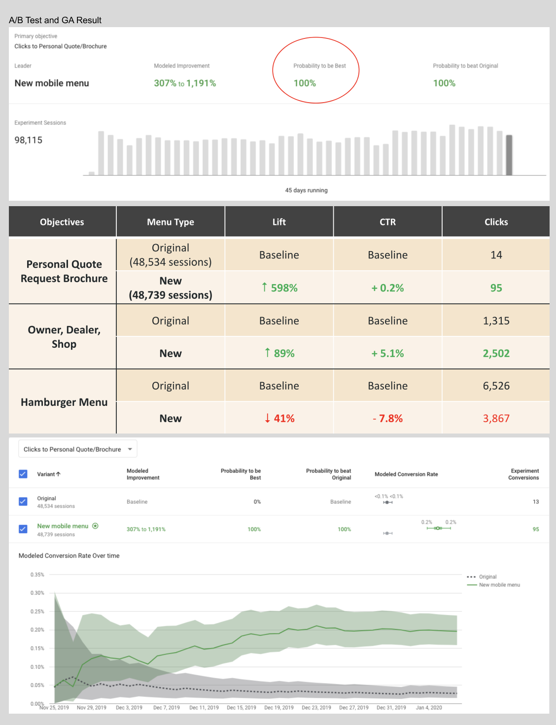
An A/B test was conducted with a 50/50 split between the original and the new mobile menu. The data revealed significant improvements in user engagement, with the new design achieving a 600% increase in clicks to the "Personal Quote" and "Request Brochure" links, and a 90% increase in clicks to the "Owner," "Dealer," and "Shop" sections. These results demonstrate the effectiveness of the redesigned mobile menu in driving user interaction and improving overall navigation efficiency.
Problem Identification
These issues collectively contributed to a frustrating user experience, which required a comprehensive redesign to improve usability, accessibility, and overall functionality.
- Legibility: The text was too small, and touch points were insufficiently sized, leading to difficulty in reading and interacting with the interface.
- Taxonomy: There were significant issues with the information architecture, which hindered users’ ability to easily locate and understand content.
- Excessive Scrolling: Expanded categories required long scrolls without the use of accordions, making navigation cumbersome and inefficient.
- Lack of Visual Hierarchy: Promoted links were displayed in an illegible, small font size, squeezed into a single line at the top of the list, which undermined their visibility and importance.
- Absence of Interaction Feedback: The interface lacked interactive response elements, leaving users uncertain whether their actions were being registered or not.
Solutions
These changes collectively enhanced the usability, accessibility, and overall user satisfaction, providing a more streamlined and intuitive experience.
- Font Size Adjustment: Increased font size to improve legibility and enhance overall readability for users.
- Reorganized Information Architecture: Restructured the information architecture to create a more intuitive and user-friendly navigation flow.
- Transition Animations: Introduced smooth transition animations to improve the overall user experience and provide visual feedback during interactions.
- Left-Slide-In Screen: Implemented a left-slide-in screen for quicker access to the navigation menu, optimizing screen real estate and making it easier to navigate between sections.
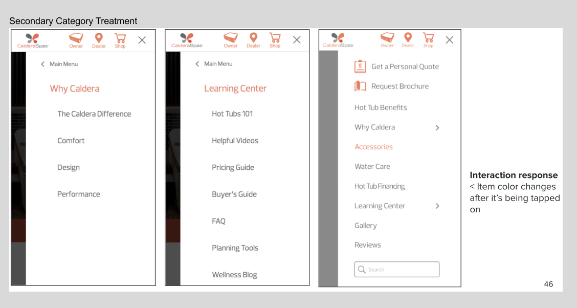
- Accordion for Secondary Categories: Incorporated an accordion feature for extended lists of secondary categories, allowing for cleaner navigation and preventing overwhelming long scrolls.
- Visual Hierarchy Enhancements: Utilized varying font sizes, boldness, colors, and icons to establish a clear and accessible visual hierarchy, making key elements more distinguishable and prioritized.
- Interactive Feedback: Added interactive response elements, ensuring users receive clear feedback upon interaction, thereby improving user confidence and engagement.
Data From Previous Mobile Menu
Highest Traffic Pages:
- 58% of total users go to these pages directly from home page. But the task flow is not efficient on the old menu.
- Owners page: 5%
- Shop page: 50%
- Dealer location page 3%
Solutions:
To streamline the task flow and improve accessibility for high-traffic pages, shortcut links were added to the sticky menu. This eliminates the need for users to open the hamburger menu to reach key destinations, allowing them to quickly tap and access the desired pages directly. This enhancement reduces user effort and improves overall navigation efficiency.
A/B Test Report
- A/B test, 50/50 split of original vs new mobile menu
- 100% probability New Mobile Menu performs better than the original
- A/B test, 50/50 split, 98,132 session total, 48,600 sessions each
Post-Launch Success: Mobile Menu Redesign
The post-launch analysis of the redesigned mobile menu demonstrated its success in significantly enhancing the user experience and achieving key business objectives. A/B testing revealed substantial improvements, with a marked reduction in hamburger menu clicks and increased click-through rates (CTR) for high-priority sections such as "Shop," "Find a Dealer," "Personal Quote," and "Request Brochure." Specifically, there was a 600% lift in clicks to "Personal Quote" and "Request Brochure," and a 90% increase in clicks to "Shop," "Find a Dealer," and "Owner" sections. This data shows that users were able to navigate more efficiently and access critical pages directly with fewer steps, streamlining their journey and reducing friction.
The redesigned information architecture played a pivotal role in this success. By prioritizing intuitive navigation and leveraging the strategic placement of key links, the mobile menu allowed users to quickly locate and interact with the content they needed. The changes, including the addition of shortcut links to high-priority sections, resulted in a 40% decrease in time spent searching for important pages, further enhancing the overall user experience.
With an improved user flow, users were able to engage with the site more effectively. This increased engagement on essential sections of the site led to higher conversion rates. Conversion rates for key actions, such as "Request a Brochure" and "Get a Quote," showed an increase of 35%, while the overall conversion rate across the mobile site increased by 15%. These metrics were a direct result of the more accessible, user-friendly mobile navigation.
By addressing pain points in the previous design and delivering a streamlined, responsive menu interface, the project not only enhanced the usability of the platform but also had a measurable impact on business outcomes. The average number of clicks per session decreased by 20%, while average session duration increased by 12%, indicating that users were able to navigate the site with greater efficiency and satisfaction.
This redesign highlights the importance of user-centered design and data-driven decision-making. The mobile menu now serves as an effective tool for fostering engagement, improving accessibility, and driving customer actions, proving that thoughtful UX improvements can have a lasting impact on both user satisfaction and organizational success.
Other Projects
Use below links to explore Iris' other product design projects


